Overcoming the Fear of Walking

I haven’t updated this blog in a while…  it’s shameful!  Even more shameful is that I’ve fallen behind on the film.  Today is a happy day though, so I had to announce it — that I’m well on my way to overcoming my fear of the Walk Cycle.

I can’t believe I have been so hung up on this one shot.  This is probably the only shot in the film that has a walk cycle.  Not only does it have a walk cycle, but it also has many things animating on the stage behind this walk cycle.  So if there is a mistake in the walk, then there is a lot of animation lost.

This shot has been lit for a few weeks.  I’ve had to prep some other things — which is a whole other post that I will get to once the shot’s done — but since the lighting has been finished I’ve also taken a vacation, done some paid gigs, done some work on the house, socialized, and generally done whatever I can to stay away from this dreaded walk cycle shot.

But now the fear is pretty much gone!  I’ve done it!  It’s far from perfect — the stand-in puppet does some moonwalking and stumbling but there’s something about it that is kinda not too bad.  I plan on practicing this a few more times before bringing the real Sabela into the set and animating it for real.  Gulp.

Sadly my magnetic-feet idea did not work for the walking.  At the end of the walk I tried to balance her in a couple of poses with just the magnets, and that turned out OK…  but it was very tricky to get her to walk, with her feet being so tiny and all.  I will have to animate this scene twice — one pass for just the background elements (there will be elements of the set rolling onstage behind her), and one pass with the set elements, Sabela, and her rigging.  I’ll then have to paint out the rigging in After Effects.

So here it is — my First Ever (EVER!) walk cycle.  I did it!  Baby steps…
Chris Landreth Talks about Character Animation

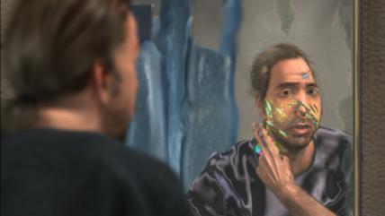
NFB ryan

I went to a talk on Friday featuring Chris Landreth, the writer / director of the 2005 Academy Award-winning animated short film Ryan.  I’ve mentioned this film here before, and how much I love it.  Chris had some interesting things to say about character animation, which, to me, summed up all the reasons why Ryan was so brilliant.  (He also showed us his new short, The Spine, which you can see glimpses of along with some behind-the-scenes footage here.)

Chris talked about his preferred visual style, which he calls “psycho-realism.”   This is where a character’s inner psychological state is represented by their outward reality.  If you’ve seen Ryan then you will immediately understand what he’s talking about here.  If a character is feeling broken and disheveled, he will look broken and disheveled.  Parts of his skull will be missing, and his hair will actively tangle, all by itself.  If a character is psychologically dependent on alcohol, the bottle will reach out to him with little arms.

There was a bit of a eureka moment for me when Chris brought up images of Francis Bacon paintings in his presentation.  I am a huge fan of Francis Bacon as well, and can’t believe I’d never made the connection before. Bacon also imposes his psychological state onto his subjects.  He could have certainly painted “realistically,” but his inner reality spoke far louder to him.

The reason Chris’ psycho-realism works so effectively is that there still IS such a strong sense of realism there.  The animation is so natural, so precise, so detailed (especially in The Spine) that the effects are completely believable, as opposed to being cartoony.  There is a fine line here.  Once you distort the human body, exaggerating features, or playing around with anatomy (taking out someone’s spine, for example), there is the risk of losing this “Francis Bacon” effect.  The reason why Bacon’s paintings, and Chris’ characters, are so effective in communicating their inner states is that there is still a solid hold on something we all know about humans.  The characters are realistic enough, in their appearance and/or movements that we can still relate to them.  (For a terrific explanation of this phenomenon see Scott McCloud’s Understanding Comics.)

However, he also was careful not to get too realistic with the character design.  If you take out someone’s spine or the chunk of someone’s head, and that character is designed in a photo-real style, you run the risk of shocking the audience too much, or making the film impossible to watch.  (Anyone who’s in Toronto who has been to the AGO recently has probably been shocked by the Evan Penny sculpture.  Yikes.)  This, Chris explained, is commonly known as the uncanny valley phenomenon.

Now, I am not a “trained” animator, so many of the issues he raised were new to me.  I approach animation as a practice in observation of outer and inner worlds: the study of movements, and the study of mind.  This requires both meticulous planning and hypersensitive improvising:  the animator needs to take in some detailed observations on the real world, how things move, how people move, but she also needs to breathe some spontenaiety and aliveness into the character, which takes a particular clarity of mind to achieve.  Chris said the animators on his team never work from dope sheets — ever — but as a stop motion animator you don’t get endless amounts of keyframe tweaking, so I feel there needs to be some sort of dope sheet planning.  There are not unlimited chances to refine the movements.  So to me there’s an art — a definite challenge — to this quality of being both “in the moment” and to being tediously obsessed with well-researched details.

Chris described three common pitfalls for character animators.  The first was pose-to-pose acting.  As a practice, he sets up visual clues for his team in attempt to rid them of the pose-to-pose method of animating, favouring more of a method acting style.  Early animation, pre-Disney, used to do this:  the character goes into one distinct pose, then another, then another.  He showed us a juxtaposition of two clips that he typically shows his animation team:  one from a 70s production of The Merchant of Venice, starring Laurence Olivier; the other a 2004 version of the same scene, with Al Pacino.  Laurence’s acting seems a little cheesy in comparison — sorry, I don’t know how else to describe it — very blocky and staccato and exaggerated.  The contrast is so extreme — Al flows effortlessly through his movements as he speaks and somehow this just translates as being more modern, more naturalistic.  It doesn’t seem like he’s acting, though his movements are just as expressive as Laurence’s.  There’s a casual quality to it that makes it more believable as a non-staged event.  So, while pose-to-pose animation may have its place, Chris prefers the smooth natural flow of a method acting approach.

To achieve this sense of flow, the animators filmed themselves acting out the characters movements, over and over again.  And studied them.  In mind-boggling detail.  (Check out some behind-the-scenes footage of The Spine to see some of what went on here… very interesting!)

The second thing the animators had to watch out for was what he called “twitching meat.”  This is perhaps something more applicable to CG animators, since stop motion is plenty twitchy enough — but generally he was talking about the easing in and out of moves, and motion curves on a graph, that should never be perfectly smooth — we all move with synapses firing off left and right, and so our moves are not mechanical or direct.  Sometimes we hesitate, waver, and twitch.

And finally the third detail for the animators to think about was saccade, or tiny eye movements.  When in conversation with someone, our eyes are always flitting about, never just focusing on one spot, but examining a whole scene, or a whole face.  Our eyes, too, reflect an unease, in the mental disturbances which ebb and flow.  Our minds are rarely perfectly still.  The more nervous and unfocused a person’s mental state, the more their eyes flit about.

The Spine will apparently premiere at the Toronto World Wide Short Film Festival, and will be travelling around to various international festivals this summer.  Be sure to check it out — I don’t have any comments on it, because I only saw it once, and on a tiny screen; all I can say is that it is complex.  And that it’s difficult to watch, as Chris freely admits.

Hard vs. Soft lighting, and How To Build a Small Softbox

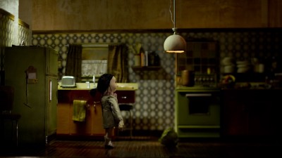
Marcus and I have finished (more or less) the lighting setup for the next shot of the film:  the intro to the kitchen, above.  It was a crash lesson for me in the differences between hard and soft light.  I mean, I vaguely understood the difference before, but this setup made it clear what works best for small, intricately detailed sets.  (For some great little tutorials explaining hard light vs. soft light, try here, and here, and here.)

The verdict (for now) is:  small, controlled soft lights work well for larger spaces of gentle, moody lighting, while tiny pools of hard light work well to accent specific textured areas.  The key here is keeping ALL light sources small and controlled.  Most of this set is lit from above, which is what would happen anyway (pretty much) in a real theatre, but also it allows the light to scrape the surface of the items in the set, showing off their textures well.

The problem as Marcus described it is that our small 150 Watt fresnels are designed to light up sets at their regular, real-world scale.  If you were to scale up these lights along with the kitchen set to match the kitchen’s real-world scale, the lamps would all be at least a foot in diameter.  That’s pretty big for all the moodiness, subtlety, and texture we wanted to achieve here.  The soft lights (made by bouncing hard light off a large piece of white foam core) we had used in the last setup don’t work well in this context, because they would be too hard to control.  There would be too much spill to where you don’t want any light, creating too much ambience.

So we went for two solutions to the problem of overscale lighting.  We either used snoots on the lights, to create the smallest of spotlights, or, for lack of snoots, made flags as close to the light as possible, so that the lights only emit through a tiny area.  (When flags and gobos are close to the light, they create soft shadows; when further away from the light, the shadows get harsher.)  These were our hard lights (used to bring out some textures, like the stack of plates on the wall.  The harsh shadows caused by the hard light emphasize the linear pattern of the plates.)

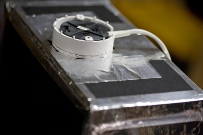
For the softer lighting effects above the countertops and lighting the fridge and chair, we built some custom-made softboxes.  We made two versions:  one was attached to a fresnel, taped on to the barn doors like an added snoot extension (for lighting the fridge); and the others (for the 2 countertops) were made using very cheap puck lights from Home Depot, some foam core, and a few other things, which I will explain below.

Here’s what you need:

1.  Lights.

These 120 volt halogen puck lights were very cheap — $19.99 for 3.   They’re dimmable, though slightly warmer than our other fresnel lights, so the other lights needed to be warmed up with orange gels to compensate.  These each had their own power source, which is important — you don’t want the type of puck lights that string together onto one power cord.

2.  Diffusion Paper.

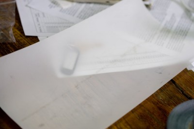
This stuff is just vellum, as far as I can tell.  Just make sure it’s heat-proof.  I’ve read that parchment paper can work for this too, as it’s designed to be used in an oven.

3.  Tape.

I used a layer of aluminum tape that’s usually used for duct work, available at a hardware store.  The advantage to this stuff is that it’s heat resistant.  I also used black duct tape to cover up the shine of the aluminum.

4.  Honeycomb grid.

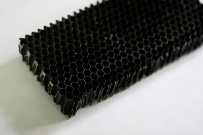
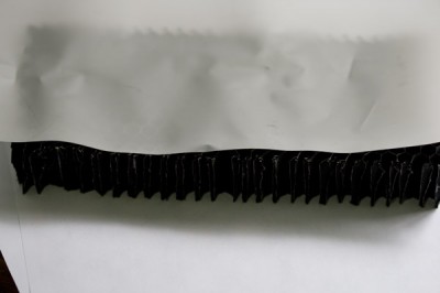
This was a present from Marcus — it’s been sitting in his garage, unused, since 1984, apparently.  It comes from an airplane hangar?  Or the plane wing?  Or something.  But it’s commonly used in lighting, just for this sort of application.  You can also use the grids that cover those institutional-type fluorescent fixtures — kind of a white plastic grid.  The honeycomb pattern is a little more advantageous, but the square pattern of those white plastic lighting covers will do.

5.  A large-ish sheet of black foam core, 3/16″ thick.  It has to be black, so it contains the light and doesn’t bounce it everywhere.

How to build the softbox:

1.  Cut honeycomb grid and diffusion paper to size.

The size should basically be the area that you want to light, and fairly small.  These lights don’t spread much across the diffusion, as they’re not too powerful — these ones were built to be around 4″ by 10″.  The idea was to have one softbox hovering over each of the countertops, which were about this size.  Tape the edges of the grid with aluminum tape (if they’re sharp metal), and attach the diffusion paper to one side.  This side goes on the inside of the box.

2.  Cut foamcore into shape to make a box.  I cut one large sheet that was the full dimension of my box, 10″ by 22″, then scored creases so that it folded into a box shape.  (Sorry, I didn’t take in-progress pictures!)  So, the final box was going to be 10″ wide, 8″ high, and 5″ deep.  So I knew one side would be 8″, the top 5″, the other side 8″, and the bottom 1″ (to allow for a 4″ opening for the grid.)  Total = 22″ in length.  I then scored one side of the foamcore into these dimensions, and folded it up into a rectangular, open-ended box.

I cut 2 pieces of 8×5 foamcore for either side of the box, and taped all the seams (including the scored ones, to reinforce them) with the aluminum tape.

3.  Measure the diameter of the light casing, and cut a hole.  You could put 2 puck lights per box, depending on how bright you want the source to be.  We used 1 for each of these.

4.  Secure the grid to the open space at the opposite end of the light.

The light shines through this, down through the diffusion paper, and through the honeycomb.  The diffusion paper softens the light, while the grid contains the soft light and prevents it from shining all over the place.

We taped a grip plate to the side of the box, because that was what worked best with the set — we could only put the grip in from the side.

I then covered all the aluminum tape with black duct tape, so that the aluminum wouldn’t reflect onto the set.

5.  Insert the light.

The light should be pretty snug, so that it doesn’t drop into the box.  Then it can be taped in place with a few pieces of the aluminum tape — not too many, in case you need to adjust it.

6.  Carefully poke a few air holes through the top of the box.  These lights will get pretty hot, so it’s important to let heat escape.

That’s it, then rig in place!

Just for comparison — here is my original, lame attempt at lighting this same set.  There is some soft light on the fronts of the cabinets, making lots of ambient light, and soft shadows, but not really being controlled well.  Then there’s a hard light lighting the fridge and chair in the corner — hard frontal lights create ugly harsh shadows.

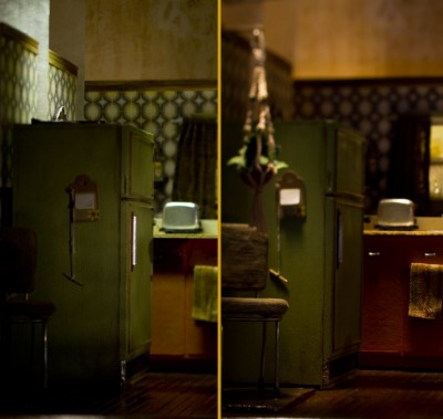
In fact, if you just compare that area of the set, you can see the difference between hard and soft light.  The image on the left has a 150 watt Arri directed at the fridge, and on the right is the final lighting setup, where this corner has been lit by a small foamcore softbox.  It’s a tricky comparison, because some other things changed — the focus, for example — but you can see the difference in the quality of light and shadow pretty clearly (click to enlarge):

I’m off to Vancouver and the BC islands for a couple weeks, surfing, hiking, and yogaing, but I’ll do a more detailed post on this lighting setup when I get back.  It’s a good one — lots of lights, flags, and the new softboxes!

Happy Spring!

Lighting Breakdown for Scene 14

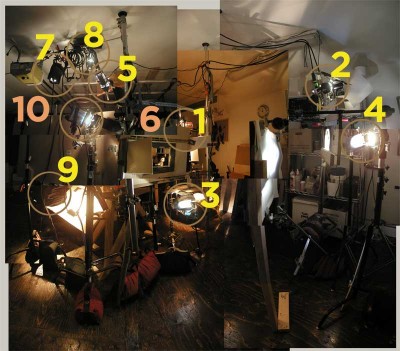
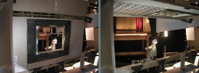
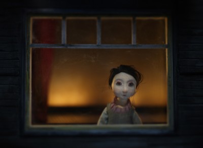
As promised, I’ve documented the setup for Scene 14, which is the one following the Amelie-like shot of Sabela looking out the window. Here we see her from the other side of that very same window. What started out as a simple 7-second shot somehow turned into a mammoth lighting and dolly setup that took about 2 weeks to design and build.

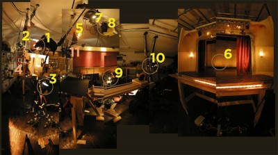
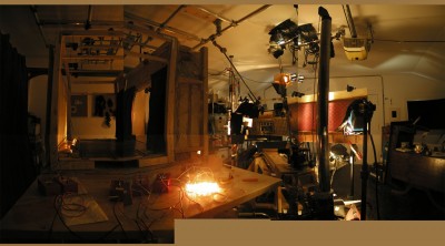
I’ve made a video and some panorama collages of the setup, in the attempt to explain what’s happening there lighting-wise. The info is second hand from Marcus, remembered and repeated with 90% accuracy, guaranteed 🙂

It’s 10 minutes long, but be sure to watch til the end, where I show a little timelapse of the lights turning on sequentially to light the scene, so you can see what each one is doing.

We used a total of 11 lights on the scene. Three Dedos, eight Arris — all 150 Watts.

The Breakdown (more or less in order of how they were added to the setup):

1. The Main Light: Dedo with barn doors, orange gel. This is the warm side light to illuminate Sabela and the window wall. The light bounces off a large white foam core card: the card is the light source here. (Bouncing lights off cards helps to soften them in such a small, delicate set.) The light is flagged by four pieces of foam core, which help crop the light into a vignette on the wall, and limit the light on Sabela’s legs, so that they fall off into darkness at their base. (We will have to bring back this vignette effect in post, as some of it was lost when lights #9 and 10 were added at the end… Those two bounce cards spilled a lot of light everywhere, which you can see happening in the timelapse at the end of the video above.)

2. Special Dedo. This light has a projection lens and iris unit, which allows us to have a precise spotlight on Sabela’s face. The light is filtered through a diffusion gel to soften its edges, as well as a pinkish-orange gel, as her face was looking a little sickly green without it. (Maybe because of the green hue to the glass?)

3. Blue Gel Arri from Below. This one shines up onto a piece of white foam core on the outside of the wall, opposite to the orange foam core of the main light. This bounces to create a soft blue moonlight on the outer wall, as well as a 3/4 backlight to Sabela’s face. It also helps fill the shadows created by the Main Light.

4. Back Blue Gel Arri. A light shining through a flicker rig, as well as diffusion paper-backed black wrap. The black wrap has been punctured with strategically-placed and -sized holes, creating a small starfield in the window.

5. Far-Away Dedo. This orange-gelled light has barn doors that are open about 1mm, just creating a soft-edge highlight on the red theatre curtain, which is reflected in the window.

6. Line of 4 LEDs. These are lined up at the back of the theatre set, out of sight. They are placed about 5 cm from the back wall of the theatre, and cast a gradated glow there. Since LEDs tend to be cooler than incandescents, we’ve added orange gels to them.

7&8. Pair of Arris with snoots. These are placed at a sharp angle above the extra theatre wall to create two scalloped beams scraping down the side of this wall.

9&10. Two foam core bounce cards (lit by another pair of Arris). These fill in the details of the wall that weren’t lit by the scallops: the wood below the chair rail of the wall, and the wallpaper detail to the right of the scalloped lights.

11. Hair Light Arri. This was brought in at the end of the lighting design process: the finishing touch. The back of Sabela’s head was getting lost in shadow; it seemed like she needed a highlight in her hair to add some dimension to her head. The light is flagged to avoid spillage onto the window frames.

The Star Field (& Apparatus):

To animate Sabela more easily, and — particularly — to add and remove her eyelids when she blinks, Marcus suggested using a piano hinge to rig up the window wall. This way the wall can lift up between shots, making Sabela more accessible. The hinged wall locks into place with rare earth magnets at the base, ensuring that it lands in the exact same place every time.

High fives to Marcus for his awesome lighting job on this one!!!

Now to tear it all down…

*Edit* — Here is the shot itself, pre-post FX.

Coraline

I received two very special pieces of paper this past week.  One was an animated card (a Phenakistoscope) from Shelley Noble — it’s so impressive to see a little card that animates like that!  So well done.  Thanks Shelley!

The second little piece of card was an advance screening pass for Coraline.  I was SO EXCITED to see this show last night that I waited in line an hour and a quarter before it started… and it was a very full house, so I’m glad I did. Chris Landreth (writer / director of Ryan) was there to introduce Neil Gaiman, who in turn introduced the movie and did a Q&A at the end.  I wish there could have been a whole second Q&A for Chris Landreth, but oh well.

I can’t really even describe how much I loved this movie.  So I won’t.  It’s very rare that there’s such delight in the visuals of a movie that tears come to my eyes while watching, and though it’s incredibly cheesy to say, that’s just what happened.  Several times.

The story was amazing, the visuals absolutely magical, and the animation, well…  I feel partly depressed and partly inspired, I guess.  The only thing is, if anyone is reading this, you MUST go see it at a theatre in 3D.  The 3D just adds so much to the experience, and the film is really designed to be seen that way.  Apparently here in TO it is only on 3D screens for the next 3 weeks, as some other silly 3D movie is coming out to take its place.  It’s unlike anything you’ve ever seen before (stop motion in 3D!)  Go see it!!!

In the Meantime… Darkness & Dolly Tests.

I’m very close to shooting the next scene, but have been working out some wobbly dolly issues.  I think I’ve figured out a solution, albeit a temporary one — it’s the Fix It In Post solution, I’m sorry to say.

The good news is that it’s exciting to see the scene move in 3 dimensions as the camera pullback.  With our 3 main planes — the theatre set, window pane, and starry sky — there’s an interesting parallax to the scene as the camera moves through space.  And, of course, the lighting that Marcus has set up is so lovely.

On Friday the west end of Toronto had a power outage for 24 hours, which threw off my schedule a bit.  I can’t believe this kind of thing can happen here, but we had no power in the house (and studio) for an entire 24 hours, in -20 degree C (-4ËšF) temperature.  The inside of the house was 4 degrees C (40ËšF) at its coldest.  Memorable moments include trying to pour olive oil out of the bottle onto a salad and finding out that oil can completely solidify in cold temperatures; seeing my breath in the air while talking on a dying cellphone; huddling with 2 cats under quilts and blankets; and actually wishing I had access to a dozen or so Snuggiesâ„¢ so that I could read a book in bed without taking my arms out of the covers.  (Clearly delirium had set in…)  I was eventually rescued by friends in the area who had heat and power, and kindly plopped me down under an electric blanket, with food and tea.

Now, all warm and cozy, I love and appreciate furnaces and cups of tea more than ever before, and I’m back to figuring out how to fix the matter of the wobbly dolly.

My best solution for now is this:  Tracking the corner of the window frame in After Effects, but not actually repositioning the shot… just analyzing it.  Then using the image of the path of tracking points, attaching the footage to a Null object layer, and repositioning it (via the Null) frame by frame, by eye.  If anyone out there knows AE, and a way to do this with expressions, please let me know; but for now, the “by eye” method doesn’t seem too bad.  I don’t want to stabilize the footage, because the window does need to move through frame — I just want to see how the path deviates from a straight-ish line, and fix that.

Here’s what the tracked path analysis looks like, above left, zoomed in 800% to the upper left corner of the window frame (which made a good high-contrast tracking point.)  To the right is the Null object correction for the jitter.

The “Before” footage of the dolly move.  There are a couple of lighting pops, in the overall lights and in the starry background, but I know what’s caused them and I’m mainly looking at the dolly move here.

And the “After,” which is my stabilized version.  I think it worked out pretty well…  Not perfect, but I didn’t spend TOO much time on it as it’s just a test.  I only did the AE test to see if the footage COULD be stabilized without compromising the overall effect, and I see now that it can be done.  So, for now, the dolly will be fine!

I know I promised a lighting setup diagram, but it’ll have to wait til I get these issues sorted, and shoot the darned shot.

Groovy New Clothes and Dolly.

I don’t know what it is about the holidays — the non-stop eating, visiting, socializing, languishing in PJs til noon every day, or what, but it’s been extremely hard to get my butt back in gear this past week or so.  Not so long ago I used to get up at 6 or 7 am and work pretty hard all day, getting lots done, and feeling pretty accomplished.  Lately I’ve been dragging myself out of bed no earlier than 10:00, and my brain does not wake up fully until later in the afternoon.  The simplest of tasks takes three times longer than usual.  I feel like I’m in a bit of a daze.

I’m hoping to get back to my usual schedule and frame of mind soon.  It’s been a very sad week — we found out that our cat, Nova, has lymphoma.   Her health has been slowly deteriorating, and there’s not much we can do other than try and keep her comfy and give her lots of TLC.

In film-related news, here’s what’s been happening:

Alli has finished two of the puppets’ clothes.  Here’s what Sabela’s mom and dad are looking like:

So this is Liberdade and Xosé Luís, clothed in their 70s-inspired grooviness.  I’m particularly fond of the velvet pants on Xosé Luís — I could not stop laughing when I first saw him in his outfit, he was just so adorable.

These guys will be sitting, along with Sabela and her sister Abigail, at the dining room table in the final scenes of the film.

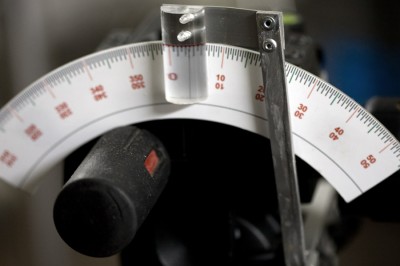
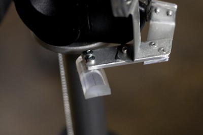
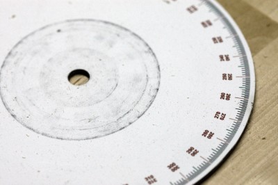
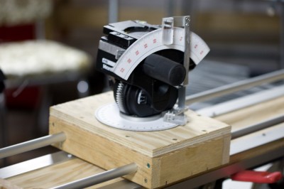
So that’s what’s happening with the puppets.  There’s also been lots of rigging and planning going on for the upcoming couple of shots.  Marcus has spent hours and hours building dolly tracks and rigging his 3-way geared head with scales for tilts and pans…

The tilt scale, above.

The base of the geared head, with rigging for the pan scale.

Here’s the pan scale, which is sandwiched between the head and the dolly.

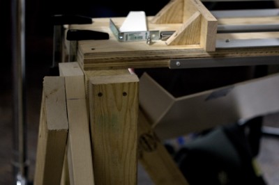
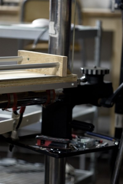
The dolly, with geared head attached.  Marcus built this mostly of plywood, with a box housing the geared head that slides on two 5/8″ aluminum rods.  The rods are slightly bendy, which isn’t a problem with this shot, but may be later on.  The dolly is strapped onto the arm of our studio stand, extending beyond the arm into a diving board, which has been stabilized by several 2x4s screwed into the floor.

The next scene of the film involves a track back with the camera, which uses the entire length of the dolly.  The setup for this shot takes up most of the studio, so it’s hard to capture on camera, but here’s a glimpse of what it looked like a couple of days ago.  It’s 99% done, so once it’s done, I’d like to figure out what Marcus is doing here.  There are about 10 lights, and 20 little cards scattered everywhere on grip stands, either flagging or bouncing light.  I’ll take a series of pictures, trying to capture the setup, and draw out a diagram / map of what each element is doing, as best I can, in my next post.

This setup was complex — this is a continuation of the previous shot, looking over Sabela’s shoulder, towards the opposite side of the window.  We see a reflection of her face, as well as the theatre set in the window, and some sparkly stars beyond the window.  Lining up these three planes for the camera was quite a task…  this setup has taken close to a week to do.

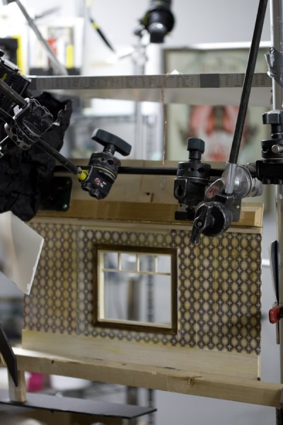
The little window opens up via a piano hinge, so that I’ll have access to Sabela (who’s standing behind the window) while animating.  The last shot was difficult, because she was standing so close to the window, and surrounded by gear, so I couldn’t access her face at all to add her eyelids when she blinked.  I had to reach delicately through a forest of arms and cables and lights to blindly place her tiny eyelids.  I was so scared I would drop them into her dress, or somewhere that would be unretrievable!  But thankfully it worked out OK.

(This image is taken with the house lights on — I’ll have some pretty “lighting” shots with the next post…)

We also had great news about our lighting and equipment rental, which we’ve been given a huge break on — thanks, Dan at White’s!

Lights! And Tears…

Oh, the drama, the highs and lows, the exaltation and abysses of stop motion animation…

These past couple days have been extremely exciting, but today ended in tears as my very first shot of the film failed.  About a second in, I started to notice that the puppet’s head was looking a little distorted, but was convincing myself it was a trick of the light or bad resolution of the preview.  As it got worse, my excuses lost their footing, and I suddenly remembered that the very first edition of Sabela had a flaw in its design.  How this flawed head made it onto the final puppet, I don’t know.

But here’s the good news!  Marcus Elliott, SuperDOP, came by 2 days in a row and built a most elaborate setup for this first shot of Sabela.  Somehow I think he used every single grip stand, every scrap of black foil, and almost every light to light up this little scene.  And I thought it was a simple scene, with just the puppet and a window, backed by a blurry, moody stage!  I was so, so wrong.

Here’s what our setup looks like:

Here’s one of our last test shots for this scene — isn’t this beautiful lighting?

And then this morning, I came bounding into to the studio with well-rehearsed dope sheets in hand, eager to start the day of making tiny objects come to life, when alas, now, at the end of the day, the champagne goes unopened, and rather than watch my little puppet sigh, Amelie-like, at her windowsill, I have instead caused her wee head to squish up into a sad, elongated doggy chewtoy.  Can you hear the violins?  *Sniff*

Here is the sad two seconds of the momentarily ill-fated Scene Thirteen, take one:

But the show will go on — I have to expect things like this to happen, especially since I haven’t really animated much in a long while.  Hopefully I’ll get there on the next try.  In the meantime, I need to modify the puppet, crowning her with a new and improved head.

Again, the good news — Just Look at this beautiful lighting!!!  Thanks Marcus, you’re a genius.  Even though ’twas I who figured out the causes of the mysterious flicker issues.  Haha.